Challenge:
Design a creative logo for Homestead Organic Spices to be used on a label for packaging.
Solution:
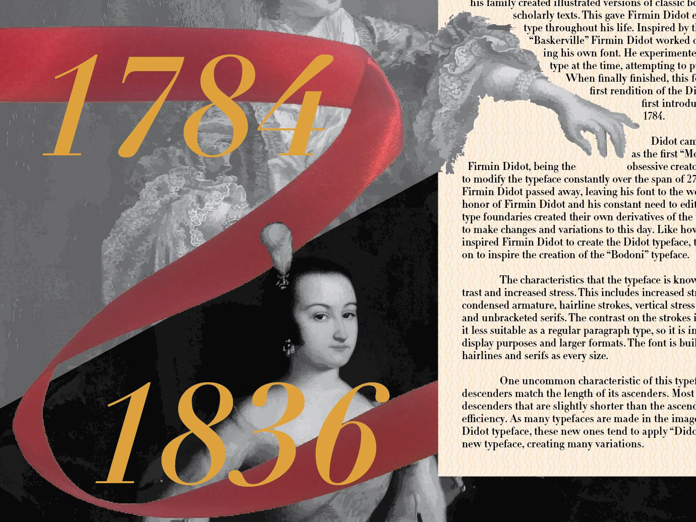
I combined the H of the original name with the shape of a spoon used to hold spices, which was then used as negative space in a pile of spices to create the logo.

Challenge:
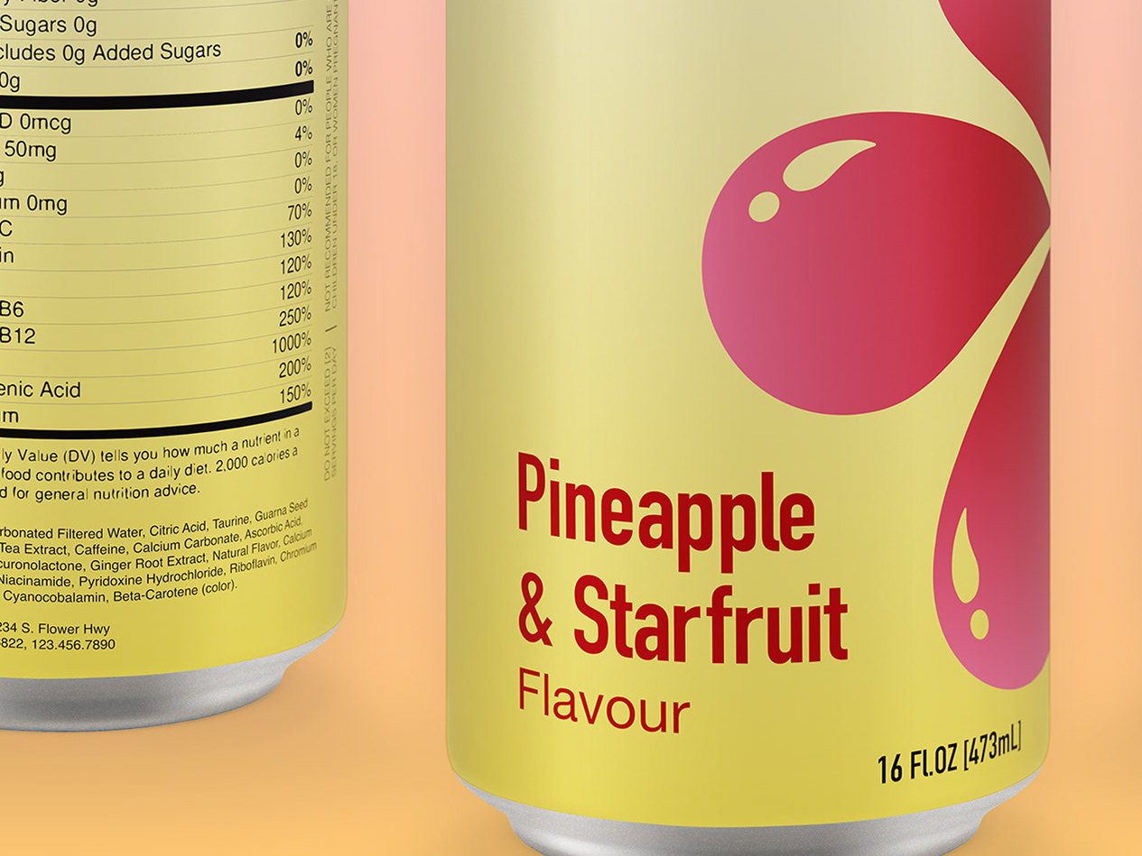
Design a creative logo for Biscus Energy.
Solution:
Inspired by the name of the company, the fruitful flavors provided, and their location in Hawaii, I took elements of the hibiscus flower and combined them with water droplets. I used a gradient in the flower form for more depth.
Challenge:
Design a logo for Silver Spur Coffee.
Solution:
I used the shape of a boot spur to call back to the name of the company. I then cut out the shape of a coffee bean to connect to their main product.

Challenge:
Design a logo for a company that sells kits containing bookmarks, tea, and other objects to enhance the reading experience.
Solution:
The kits are meant for reading so I used the shape of a book as my base. I then combined the cross paneling found on some crates.